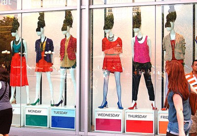
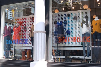
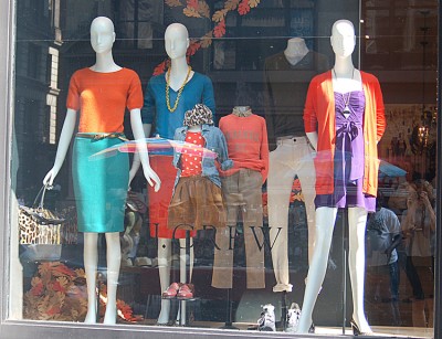
Have you noticed all the color that’s showing up in fashion this fall? The stores are showing lots of bright, pure colors, and on the runways for fashion week everyone seems to be focusing on color and especially on prints for spring.
Here are some photos I took while I was out shopping today. This is such a refreshing change for New York, where we’re usually all about neutrals and black. Not this season!
How are you wearing color right now? Are you mixing colors like the mannequins in these windows, or are you focusing on a single color? Or are you wearing color at all?


3 Comments:
The thing I have noticed about the colour palette in the stores, magazines, runways…is the use of tomato red and lipstick pink. I always went by the rule that you don’t wear red and pink together. But I am loving the ‘clash’! I have a red/pink dress in mind.
You’re right! Also, forest green with teal. Orange with hot pink. Colors that sit next to each other on the color wheel and which we were taught didn’t match. Isn’t it great?
I love the colours! I love that you can mix an match! Sadly I’m not very good at mixing and matching. I guess I should just ‘go for it’. I tend to wear a colour with something neutral like jeans or a skirt. Or a colured skirt with a black or grey top.